


Highlighting the submark – a dynamic emblem that captures the brand’s core value of friendliness


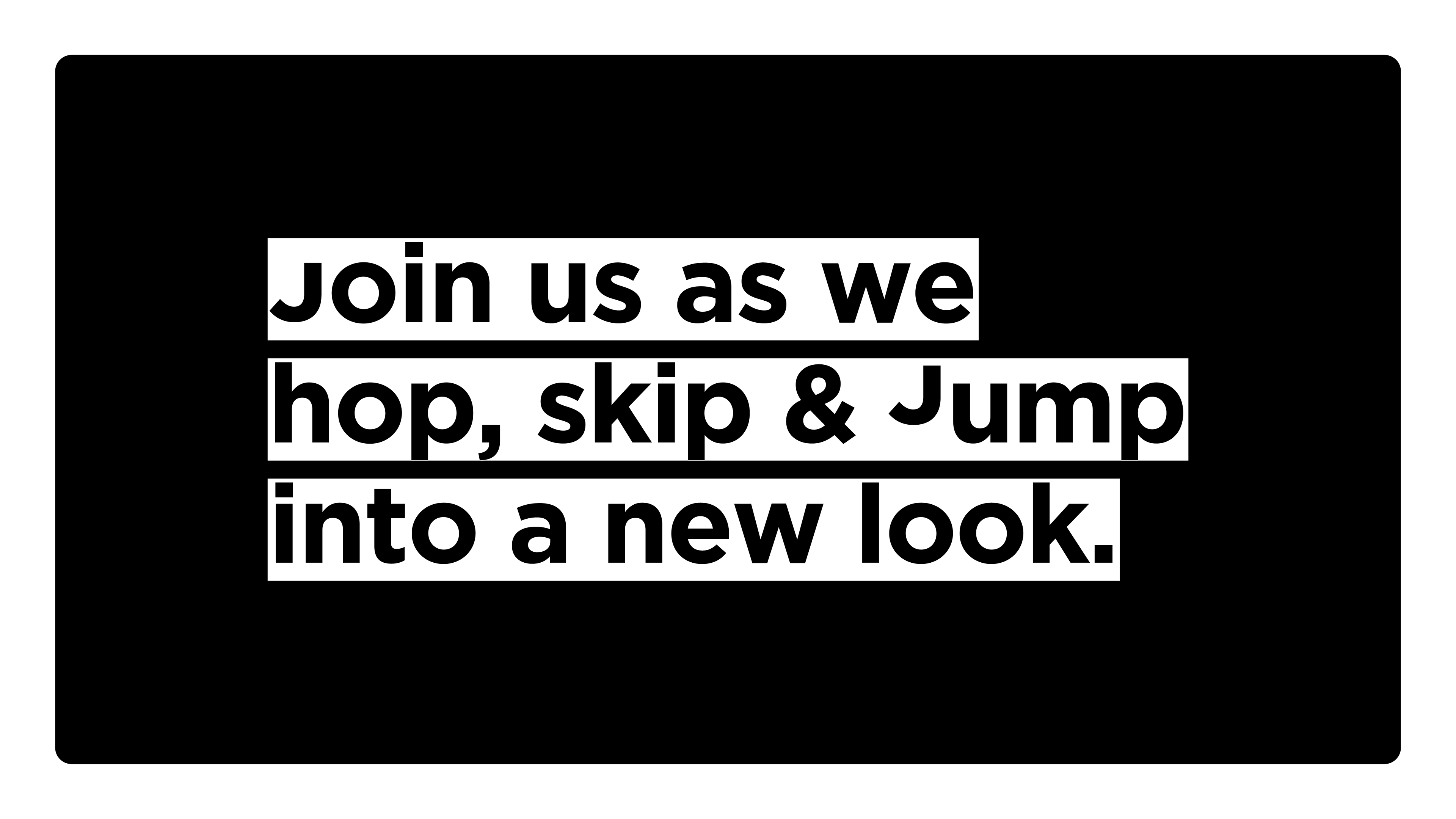
The block highlight, inspired by the knock-out printing technique, brought character to titles
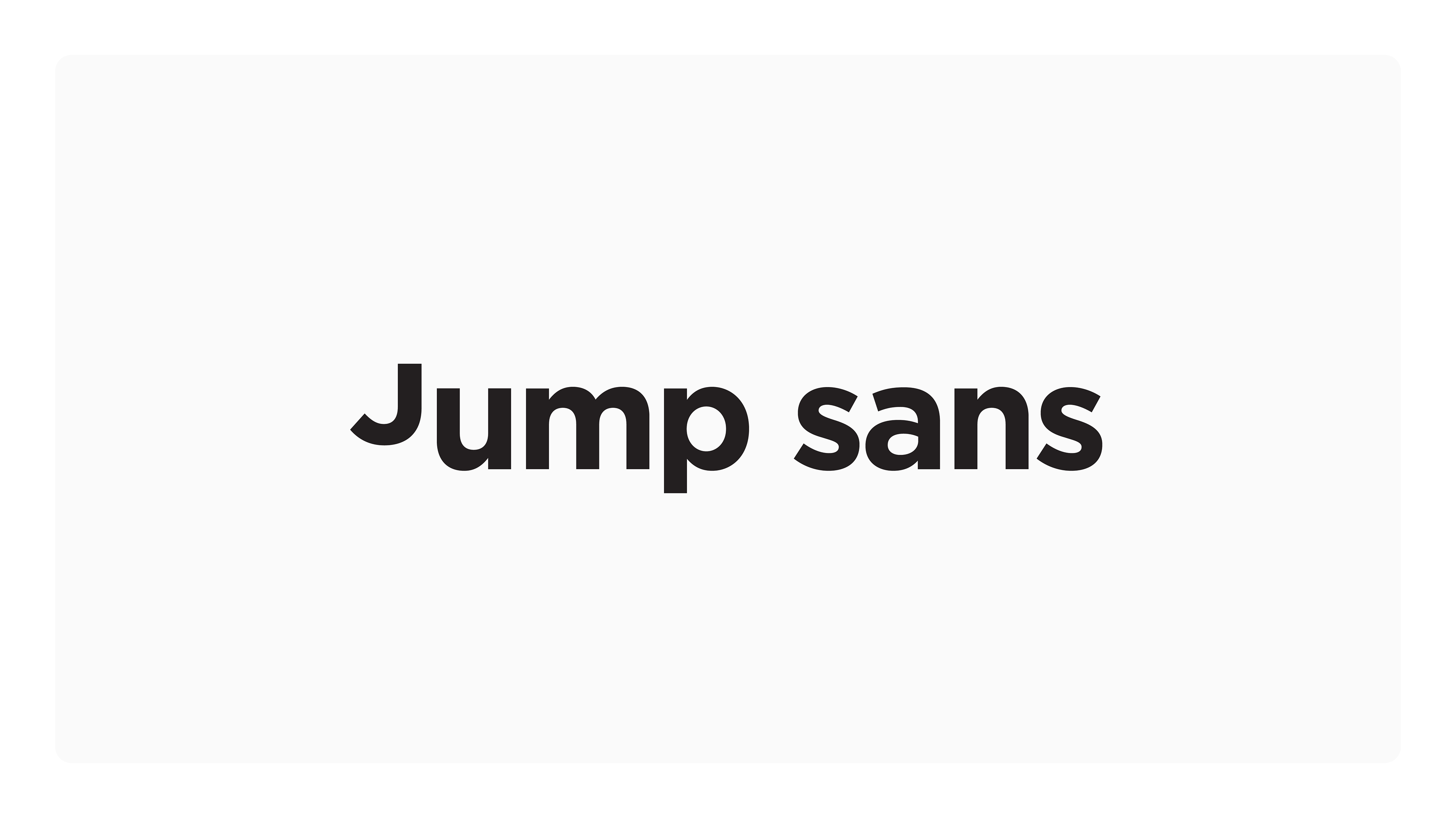
The Jump Sans typeface was created to bring an extra layer of branding to messaging
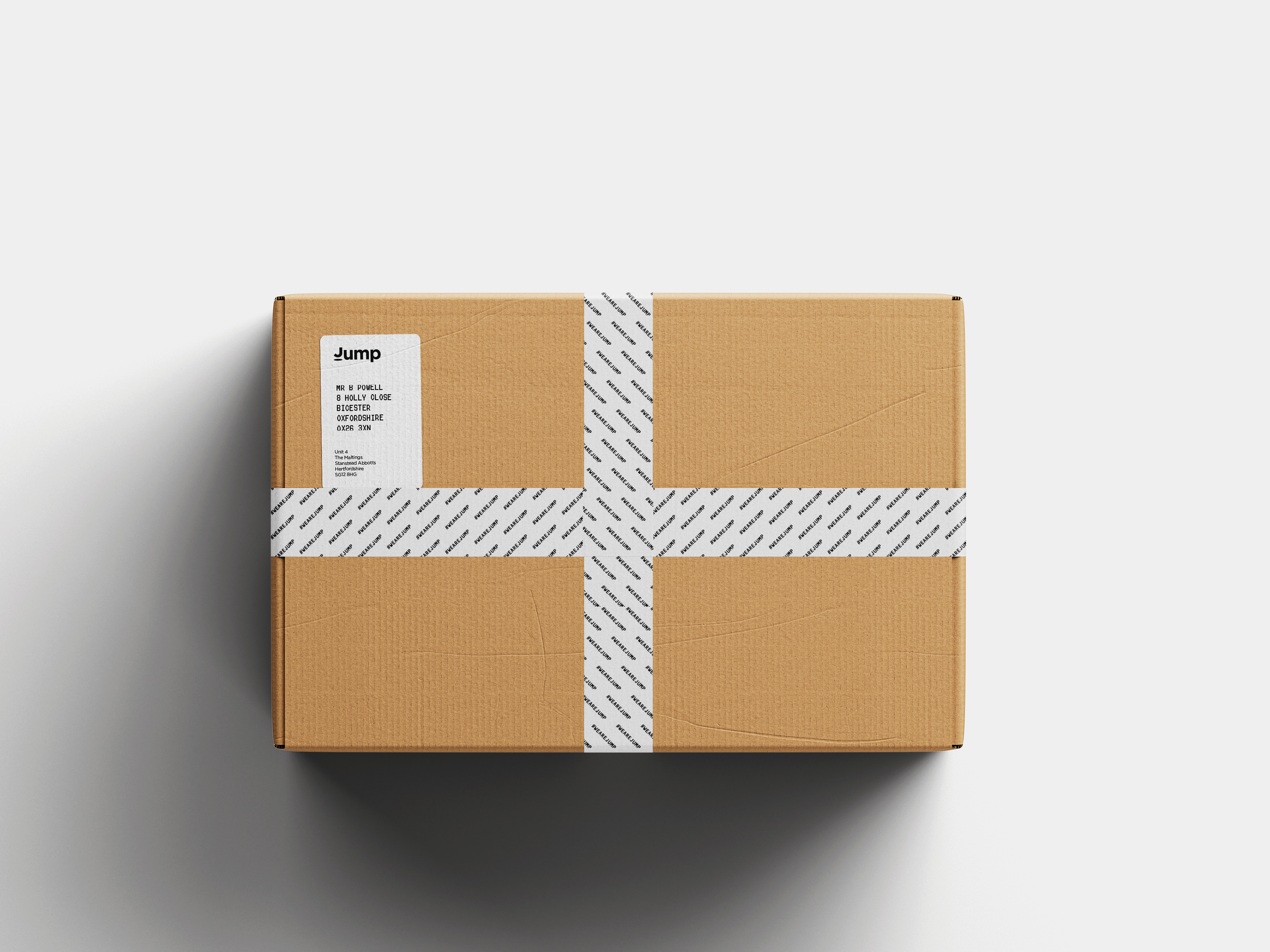
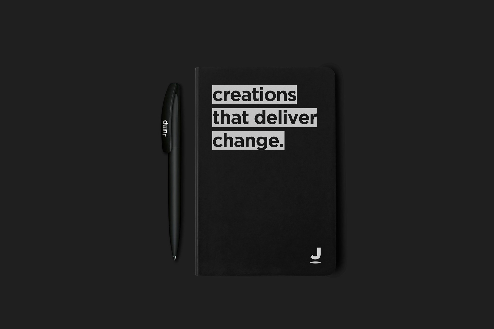
Every touchpoint, including customer delivery materials, were carefully designed to maintain a consistent brand experience
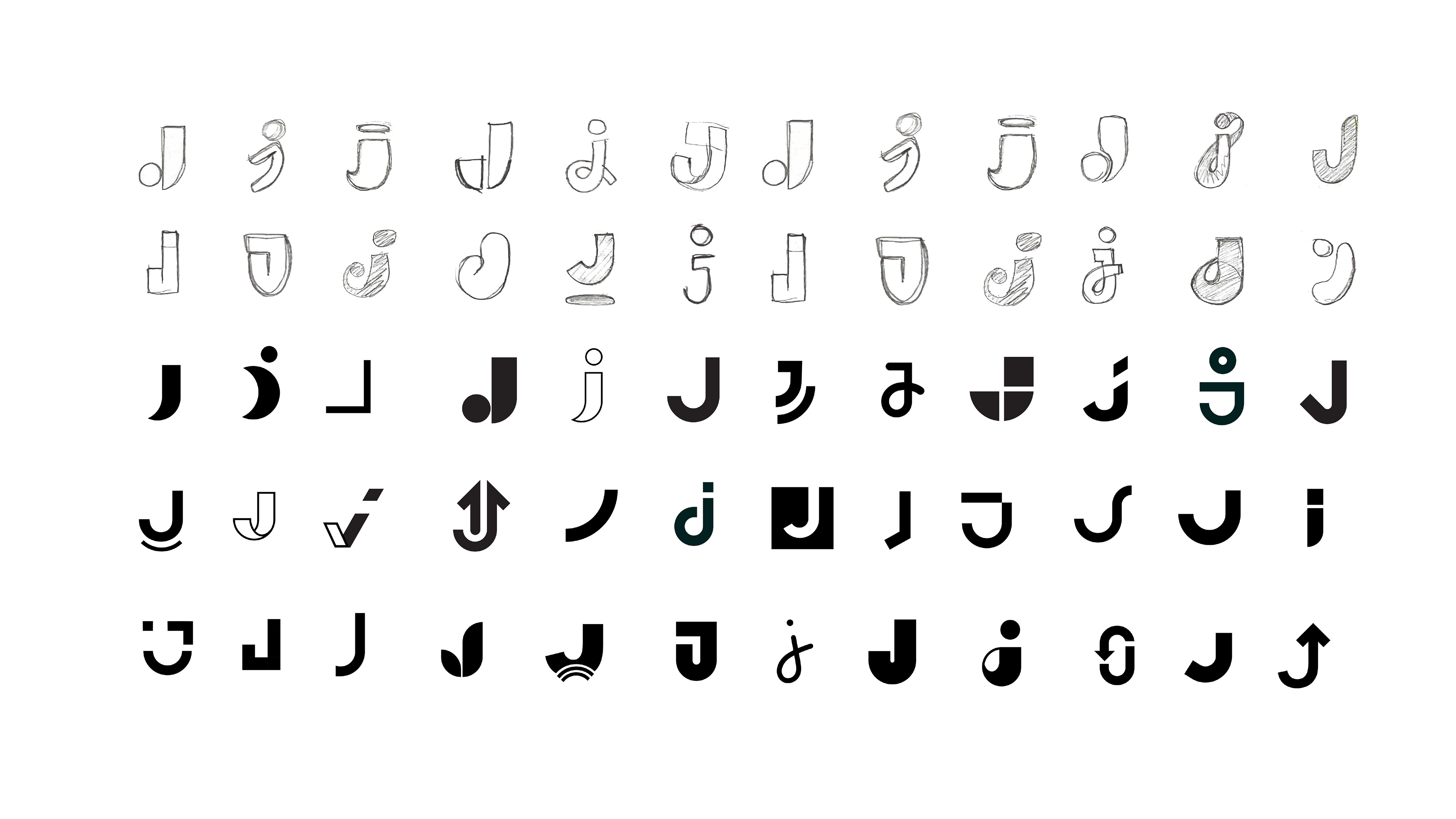
Considerable time was invested in creating a versatile sub mark

Designing a distinctive and easily recognisable J tailored to the business
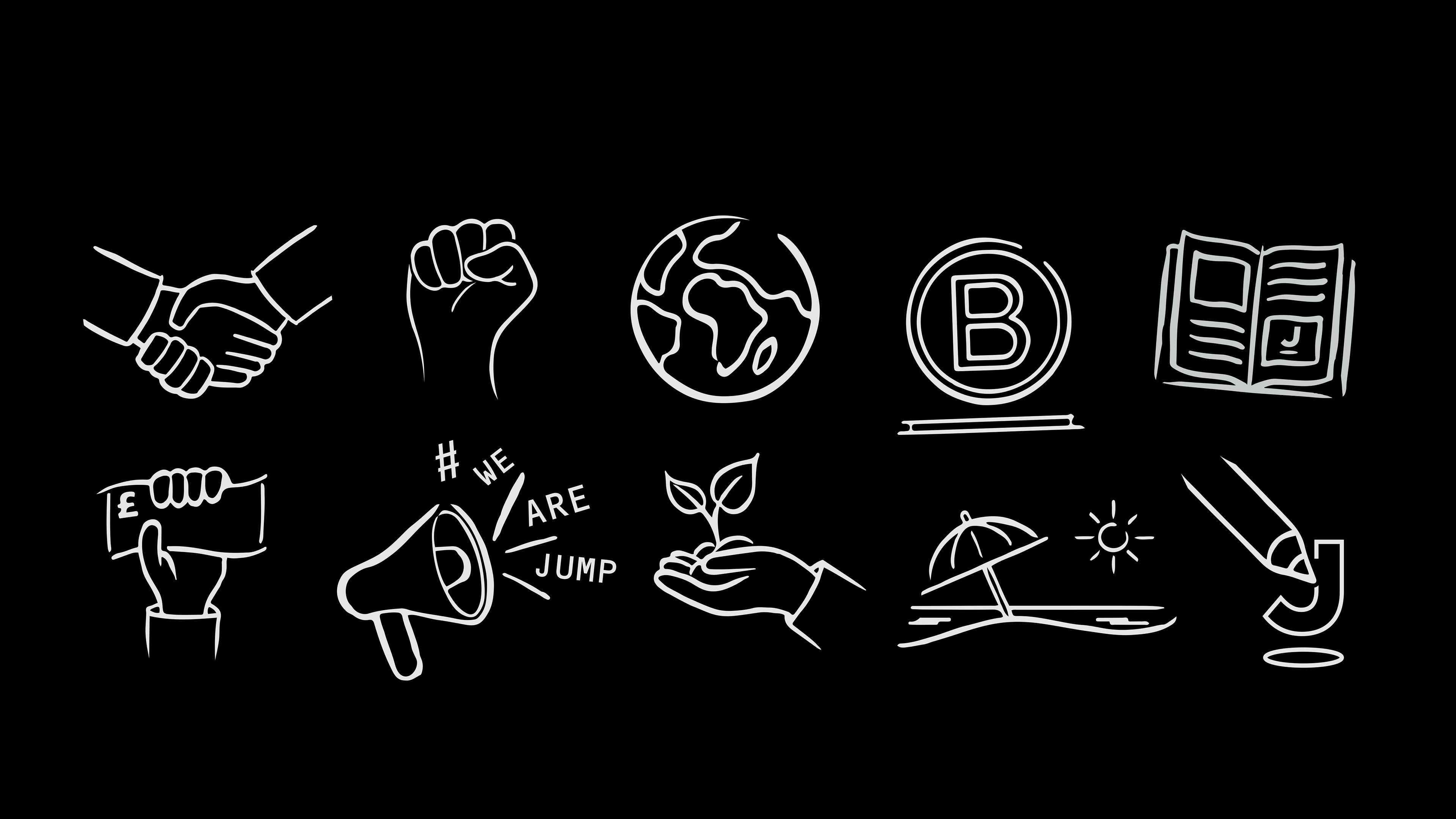
Brand assets included hand-drawn illustrations
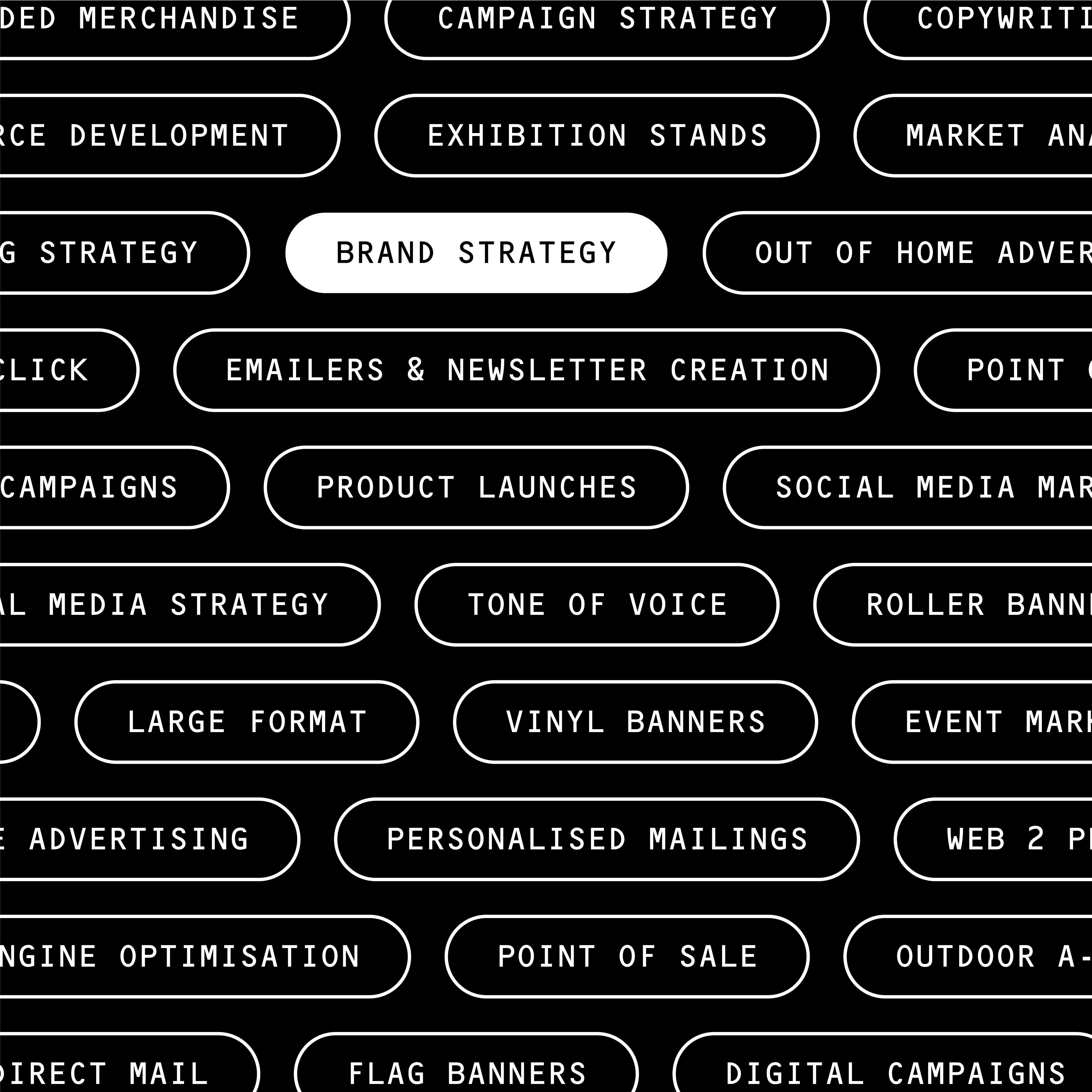
The pill device was created as a clear visual tool to showcase a wide range of services

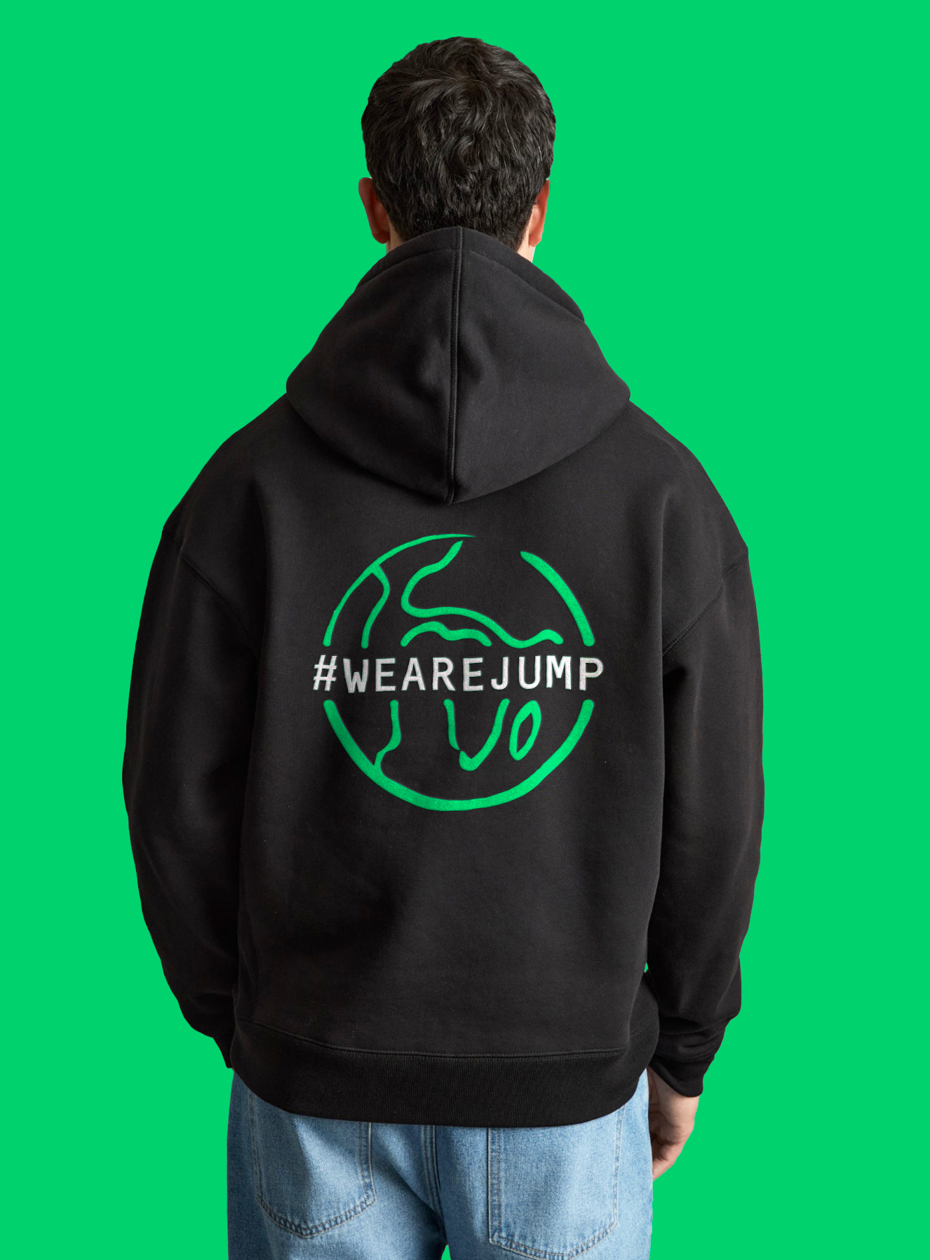

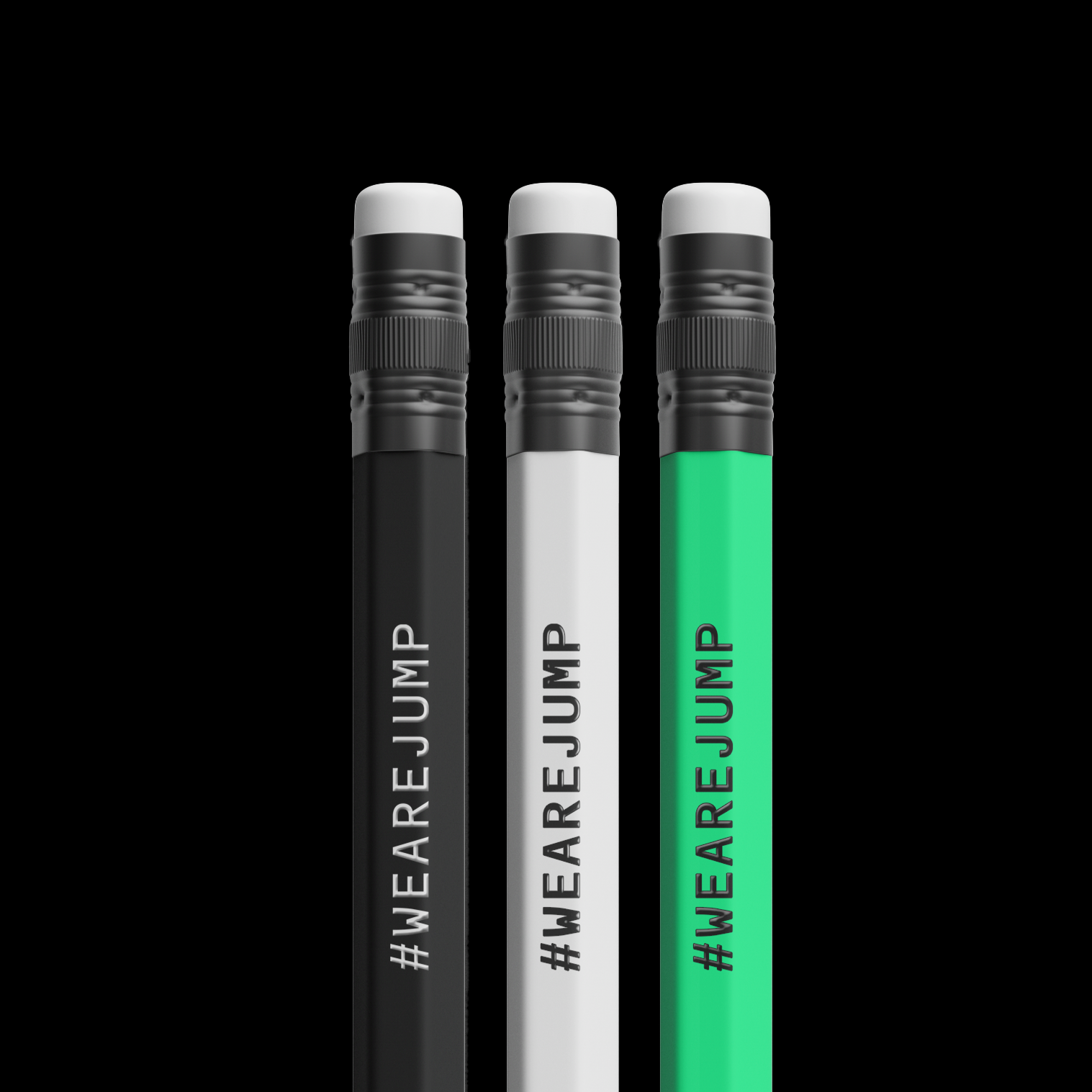
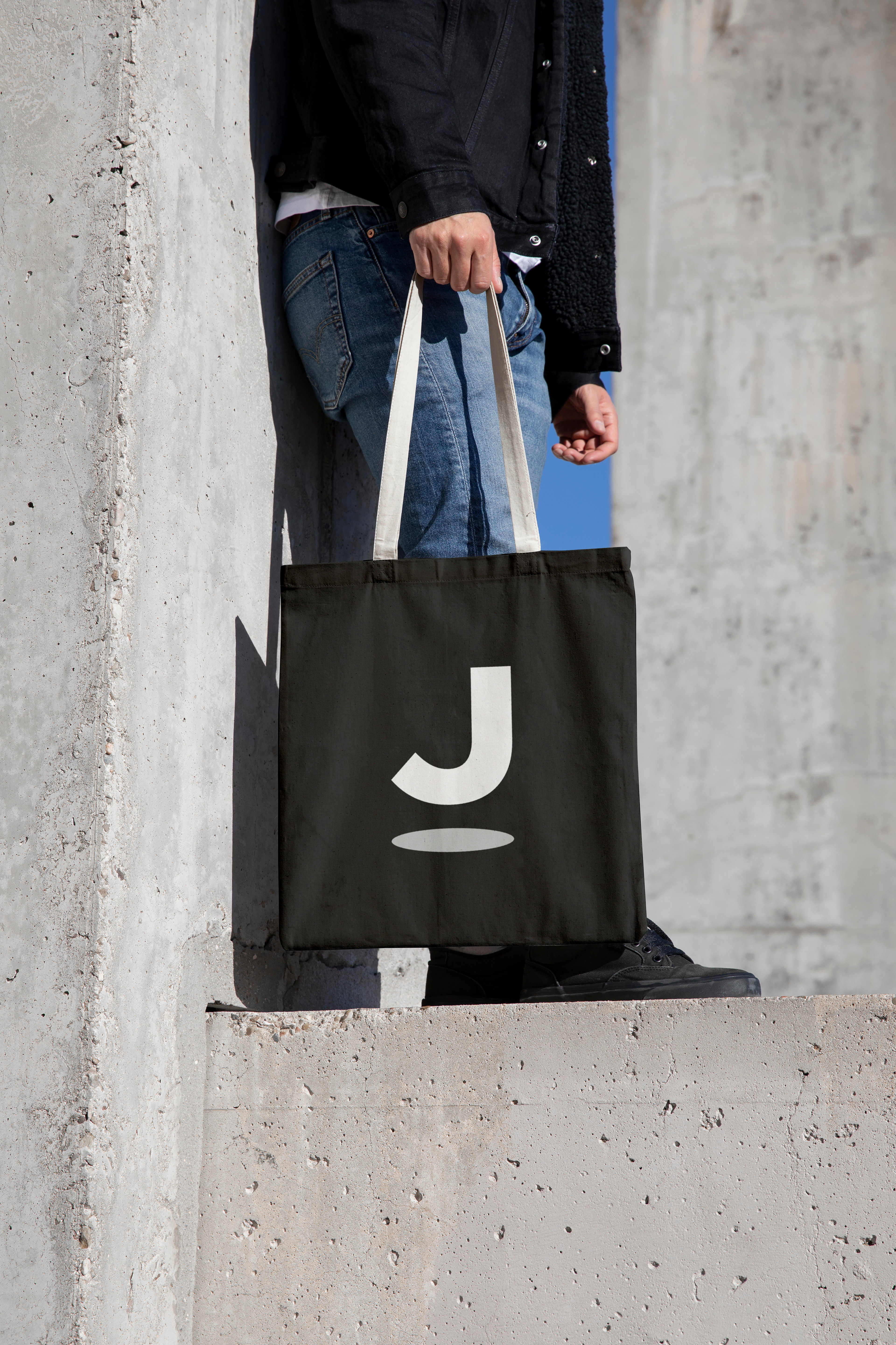
A range of merchandise was produced to promote the new identity
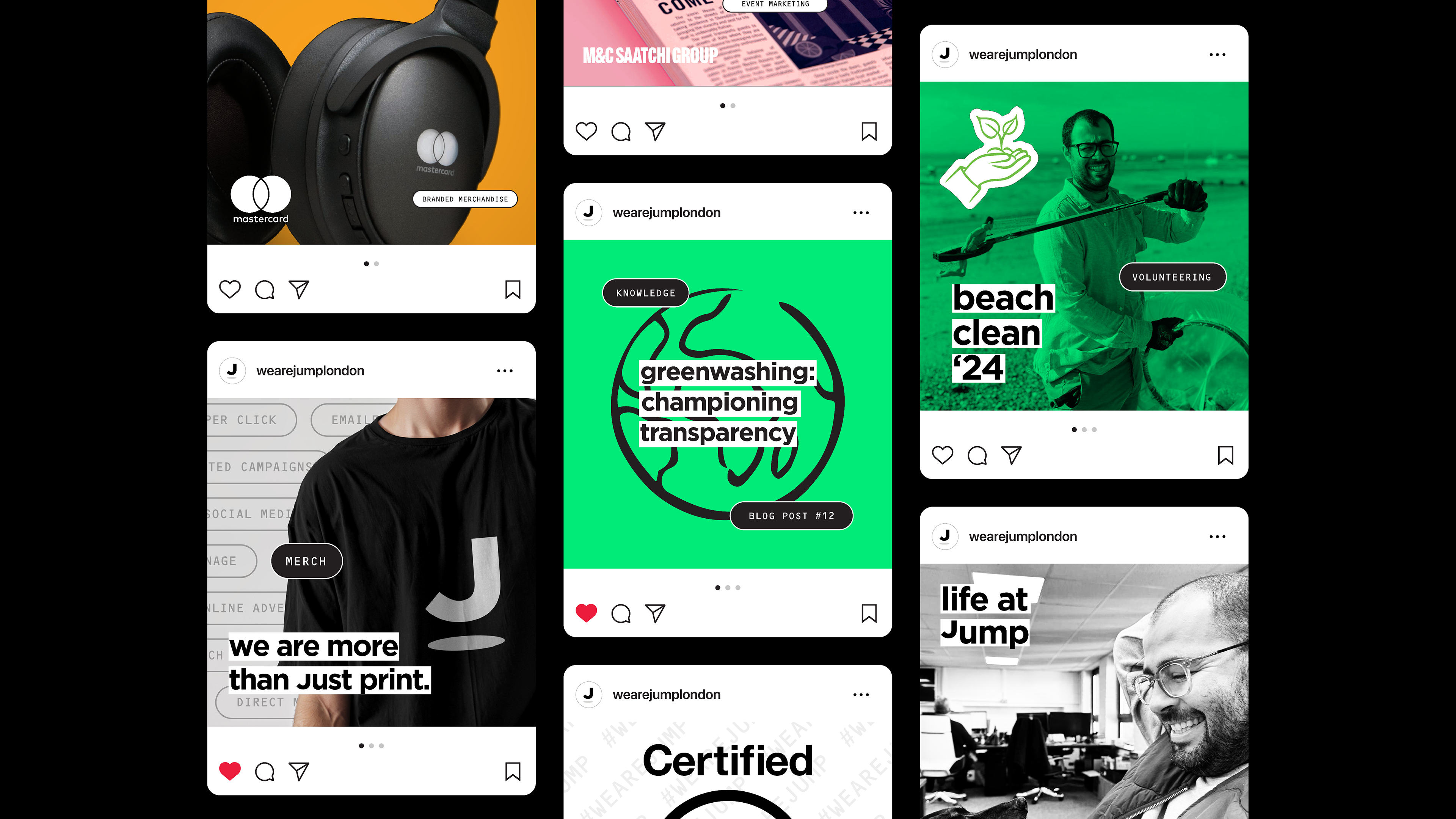
Brand assets were assembled for use across social media
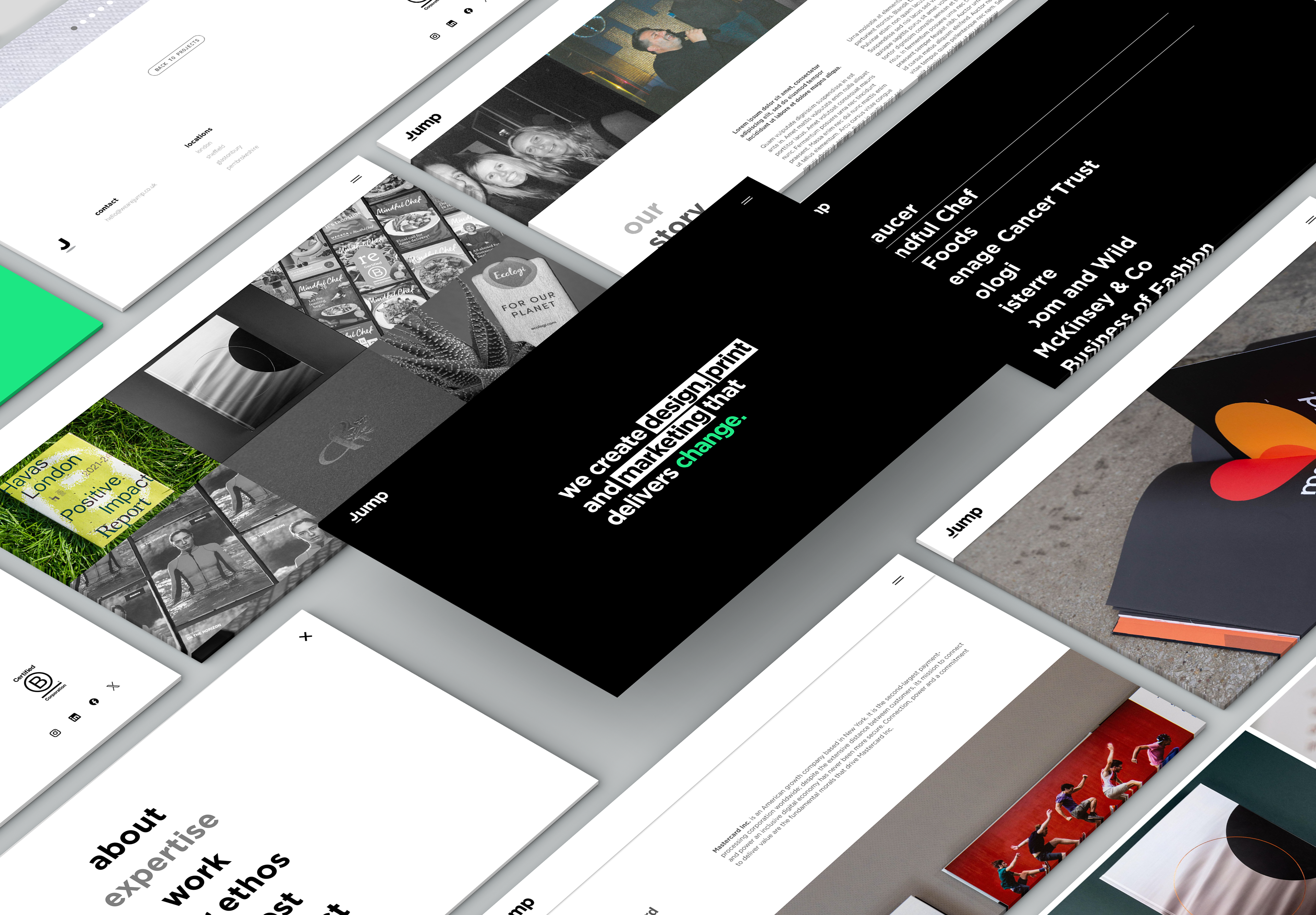
The project involved developing a new website built from the ground up